Physical Address
304 North Cardinal St.
Dorchester Center, MA 02124
Physical Address
304 North Cardinal St.
Dorchester Center, MA 02124

It’s no secret that more people browse the internet on their phones than ever before. But beyond just convenience, mobile-friendliness has become a core factor for website success. When a site isn’t optimized for smaller screens, the user experience plummets—buttons get tiny, text becomes unreadable, and navigation turns frustrating. In the era where first impressions are often made on a mobile device, checking mobile-friendliness isn’t just a technical checklist item—it’s a business imperative.
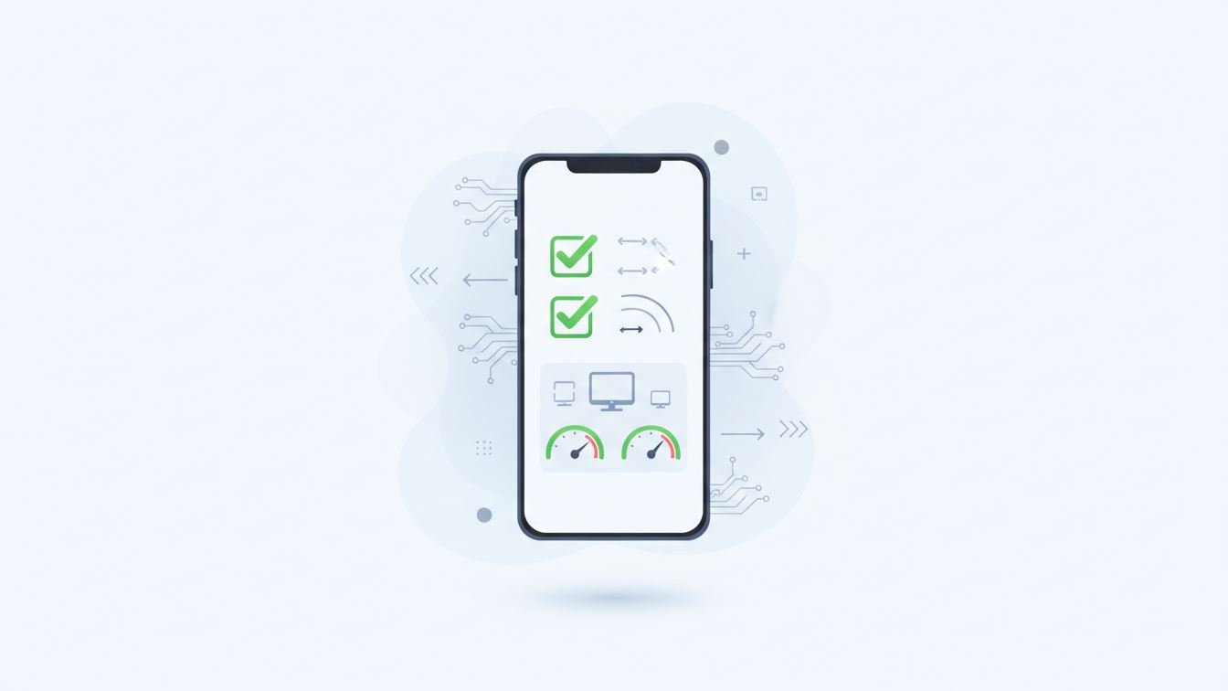
At its heart, mobile-friendliness is about how well a website adapts to different screen sizes and touch inputs. This isn’t limited to just scaling layout elements; it’s about usability, loading speed, readability, and interaction. Think of it as the difference between a paper map folded haphazardly in your pocket and a sleek GPS app that instantly guides you.
Key characteristics of mobile-friendly sites include responsive design, legible fonts without zooming, appropriately sized buttons, and quick load times—even on slower connections. These aspects ensure users don’t have to pinch, zoom, or wait endlessly to access information.
There are several tools and approaches for evaluating mobile-friendliness, each peeling back layers of a website’s performance and design:
Imagine visiting an online store on your phone. If the “Buy Now” button is too small or placed awkwardly, you might abandon your cart out of frustration. Conversely, a site with large, thumb-friendly buttons, minimal distractions, and fast checkout wins your loyalty. Another everyday scenario is reading news articles; if paragraphs stretch wider than the screen or fonts are tiny, people tend to bounce quickly.
Beyond just improving user satisfaction, there are tangible benefits to ensuring a site is mobile-friendly:
It’s easy to tick some boxes and still miss the mark on true mobile-friendliness. Here are a few pitfalls:
Identifying issues is just step one. Once you’ve confirmed that your site needs tweaks, prioritize fixes that dramatically improve user experience. Consolidate oversized images, implement responsive CSS frameworks, enlarge buttons, and refine your content’s structure for scanning on smaller devices. Remember, mobile-friendliness isn’t a box to check once and forget; it’s an ongoing commitment as devices, user behaviors, and web technologies evolve.
In the sprawling landscape of web development and digital marketing, mobile-friendliness isn’t a trend—it’s a baseline expectation. Checking your website through a blend of automated tools, manual inspection, and real-user feedback uncovers both glaring and subtle obstacles your visitors face. Addressing these ensures your site doesn’t just exist on mobile, but thrives there.
Taking the time to dive deep into mobile usability cultivates a more inclusive, engaging, and successful online presence. And in today’s fast-paced digital world, that’s a worthy investment.